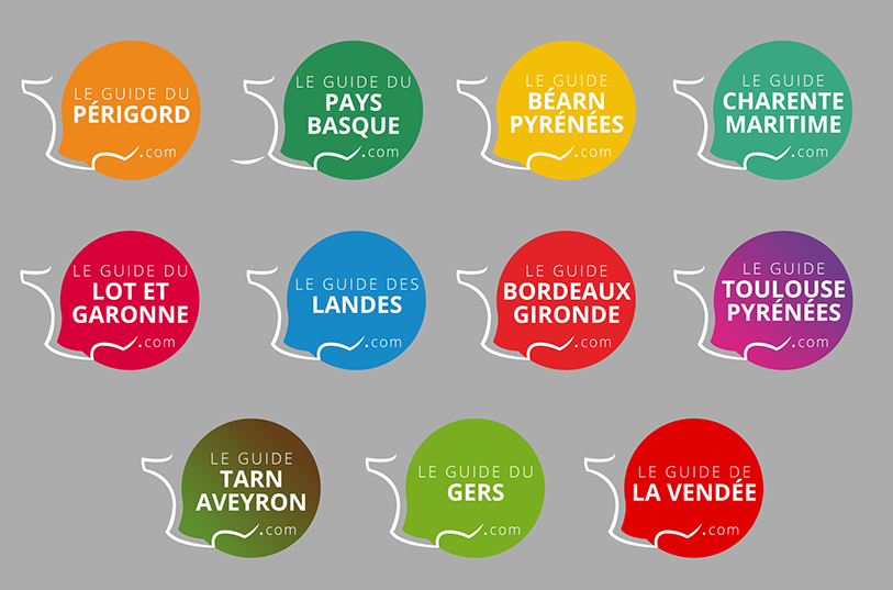
In the continuity of the creation of the new graphic versions of our guides in 2020, our team of graphic designers has imagined more modern and refined logos to homogenise the visual aspect of all our destinations. This design work was preceded by a reflection on the values that Negocom Atlantique conveys, because a logo is much more than a simple pictogram: it is a strong visual identity, which must be identifiable at first glance!
New logos to symbolise a renewal, in line with our brand identity
Our Guides are brands, which are constantly evolving to meet the aspirations of Internet users, responding to their needs by offering constantly renewed and improved ergonomics. Negocom Atlantique currently publishes 11 guides, which represent over 2 million unique visitors per year. Our logos are present on all the media and communication elements that characterise us:
- Internally, they adorn our business cards, order forms, press kits, letterheads …
- Externally, our logos are of course present on the websites of our guides, but also on the Facebook and Instagram pages that we run. We also print stickers, which are offered to our clients, so that they can put them on their shop windows, in their accommodation, restaurants, etc.
The logos of our Guides are the most reproduced visual elements, which is why we wanted to modernise them: to symbolise and highlight the changes we have made in recent years and to announce the new features that await us! The year 2021 will indeed be full of exciting developments and challenges for all our teams!

Simplify to clarify the message
After several internal discussions, we have targeted precisely what characterises our company and our multimedia products, the values that our logos should convey, if possible at a glance! Ergonomics, simplicity, access to all, efficiency, contemporaneity, travel, service, relevance… We have at heart, through our different sites, to be portals for the organisation of a trip or a stay for all those who are looking for useful information.
As a first step, we decided to merge the design of our websites’ logos with that of the parent company. To do this, we took the long line of the hexagon, which we placed on the left of the logos, to symbolise travel in France, the destinations we represent and our multiculturalism.
We have of course kept the colour identity of each Guide, which is its most important and intimate signature. Before creating a guide, we work meticulously to choose a colour, an intensity, a hue that represents the destination we are going to “tell“.
We have chosen to move from a doubled square format (on our previous logos) to a simple round format, with a shape reminiscent of a comic book or news bubble. In this way, we want to symbolise our ability to listen to our customers and the fact that we are responding to the needs of Internet users.
As far as the fonts are concerned, we have simply used the same font as our company logo, to adapt it to the logo format.
Finally, we decided to simplify the visuals as much as possible by using flat colours and removing the gradations (except for the Guides that deal with several departments, such as Tarn Aveyron and Toulouse Pyrénées). This was done to follow current graphic trends and to give our Guides a modern, up-to-date look.
On the way to 2021
Our new logos are now in place on all our media. They have also been converted by our graphic designer into animated GIFs on Instagram and Giphy, and we invite all internet users to use them in their publications.
New logos for our guides and new guides too … For 2021 we have some nice surprises in store for us in terms of destinations too! A preview below and in a future article …